Ohio City is one of Cleveland’s oldest neighborhoods. Located on the near west side, just over the Cuyahoga River, it is home to one of Cleveland’s most significant cultural treasures — the West Side Market. In 2011, the neighborhood hired Guide Studio to create a neighborhood wayfinding program ahead of its bicentennial the following year.
Ohio City, Inc. the organization that is the development steward for the neighborhood had been working to establish a “complete” community attractive to young professionals and empty nesters alike. The organization had just completed a rebranding process with another local design firm, and they wanted to bring that identity into the environment while also improving the visitor experience of the neighborhood. Providing wayfinding throughout the district was the logical next step that would elevate the neighborhood’s perception among residents, visitors, and businesses.

At the start of the project, Guide immediately partnered with Cleveland-based sign fabricator ASI Signage to help design and build the new signage and wayfinding program under a tight timeline and restricted budget. “Funding for the program was derived from TIF (Tax Increment Funding) funds allocated to the neighborhood and we were tasked with designing the most comprehensive sign program we could and have it fabricated and installed before their Centennial celebration — within 8 months,” says Guide President Cathy Fromet. “We worked out a careful plan with ASI to give Ohio City a unique program that reflected their beautiful brand, but was also effective and cost-efficient.”
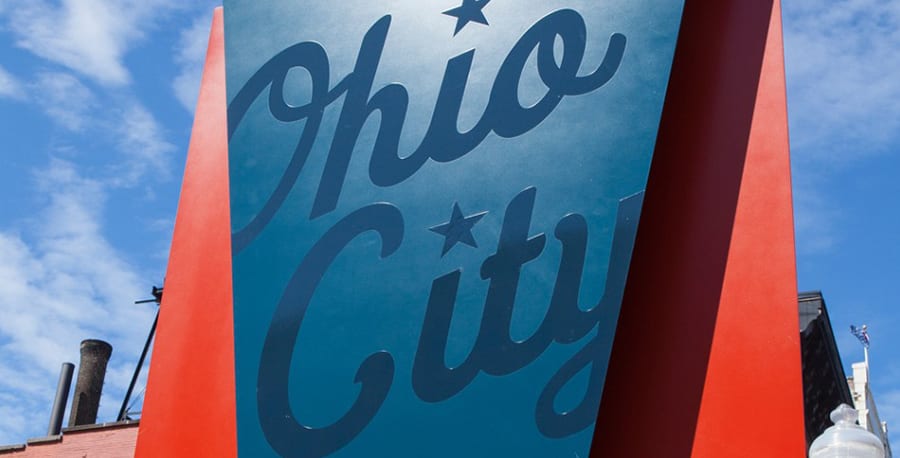
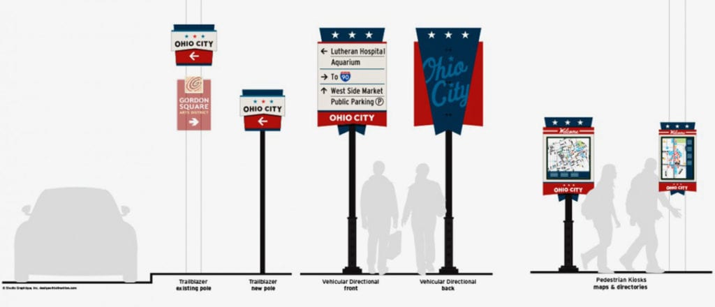
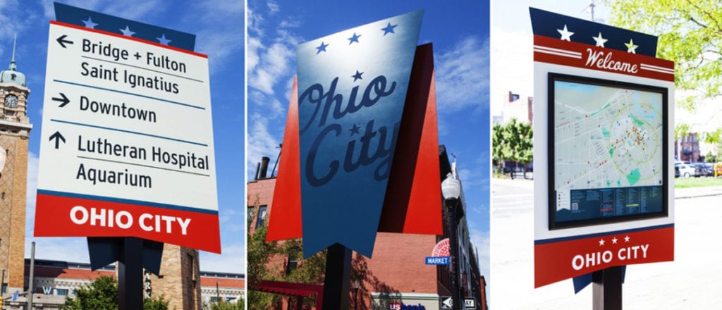
The design team played with unique shapes, panel layering and paint techniques vs. pricey materials and complex fabrication. The decorative backing is in the shape of the iconic Ohio City flag and gave signs a brand-forward personality.

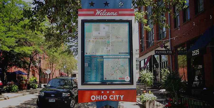
Ohio City Inc. had also been working on storefront renovation programs and an overall clean-up and maintenance of West 25th Street – one of their main commercial corridors. Pairing that effort with new signage allowed the neighborhood to enjoy an uptick in foot traffic. Pedestrian maps in the area were frequently used, improving walkability and vehicular signage provided guidance – giving visitors better access to nearby parking. Additionally, empty storefronts in the neighborhood began filling up within a year after project completion. “We won’t say it was the sign program only (that brought in business), but Ohio City Inc. recognized that re-establishing their brand and putting in a wayfinding program would improve the experience, help people feel comfortable exploring the neighborhood and give businesses the confidence to invest in this community,” Cathy says. “There has been steady progress ever since.”
Ultimately, Guide’s wayfinding efforts enhanced Ohio City’s surrounding landscape, while increasing pedestrian comfort and safety through clear information and improved navigation. Working within narrow time and budget parameters became a lesson in creating purposeful signage that can still engage the user. “Working in those restrictions is creativity in itself,” says Cathy. “It helped us to know how to work efficiently and still maintain quality.”

Featured Post
Sorry, we couldn't find any posts. Please try a different search.