

Not all college towns are alike, notes Guide Studio President Cathy Fromet. Some universities like to keep students on campus, whereas others prefer enrollees to experience life outside the comfort of well-manicured greens and stately buildings.
Thanks to a strong relationship between the City of Kent and Kent State University (KSU), Guide Studio had an opportunity to develop a brand and wayfinding campaign that ultimately benefitted both entities. Downtown Kent prides itself on its vibrant, eclectic personality, balanced with a sense of history. Within close proximity to the University, the downtown provides a unique user experience energized by the traffic from campus. The City had just undergone an extensive downtown redevelopment that extended its footprint and created this important connection, making the downtown a hotspot for students, their families, and residents seeking a fun day out.
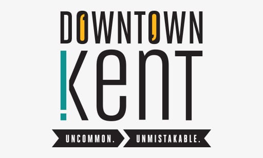
This expanded downtown challenged the Downtown stakeholder to embrace their personality and image, creating an identity that would stand out from surrounding communities.
“We wanted to instill a sense of ‘you have arrived’ when people walked or drove around the city,” said James Bowling, at the time a Superintendent of Engineering and Deputy Service Director for the City of Kent. “To do that, we needed to strengthen the connection between all of our amenities.”
The project allowed Guide to flex its creative muscles, with the design team harnessing previous brand identity work from Kent State University students. By utilizing student ideas, the studio gained an understanding of the community’s quirky character and deep-rooted industrial history.
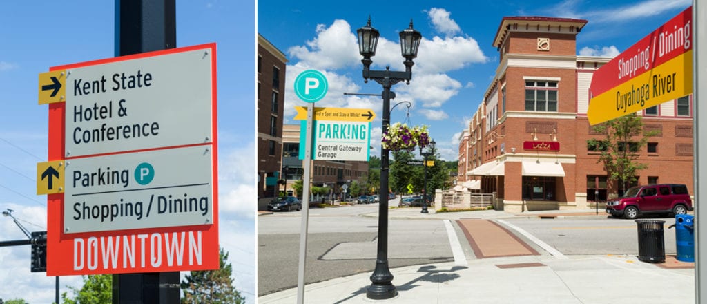
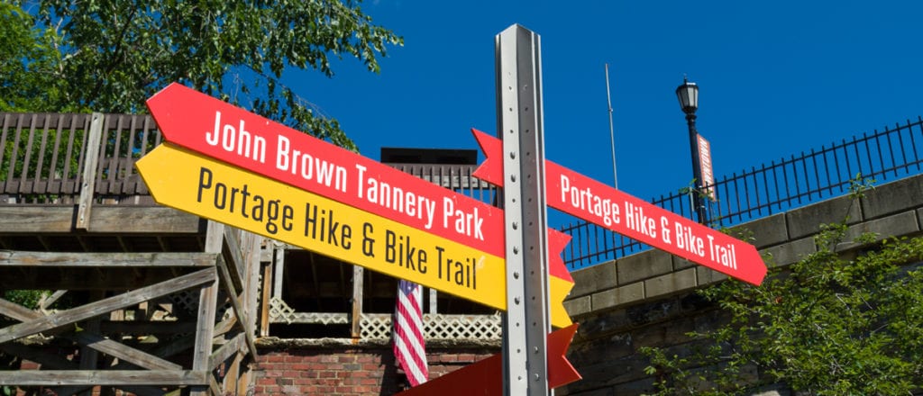
Keeping these factors in mind, Guide delivered a signage and wayfinding program that capitalized on natural gateway cues and other positive entry experiences. Like the personality of the downtown, the team created a sign system that was anything but typical. Guide’s program of gateway, pedestrian and vehicular directionals included theme’s from Kent’s railroad history that played a major role in the downtown’s development 200 years before. “We used steel beams instead of typical signposts so the signage structure had an industrial feel,” says Cathy.
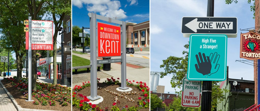
The rest of the sign design explored, an identity theme called “Kent Speaks” which featured colorful sign faces and playful messaging that complimented Downtown’s quirky personality. For example, parking signs instructed visitors to “Park This Way and Spend the Day.” Guide also built out “Black Squirrel” crossing signs, in honor of the bushy-tailed rodents’ unofficial mascot status in Kent. A customized wayfinding banner series, meanwhile, told the city’s story while navigating busy guests through the neighborhood.
Direct wayfinding signage speaks to people, including Kent stakeholders who appreciated Guide for supporting the community’s authentic personality. The program inspired the Main Street organization to use the newly created themes for future downtown and parks’ programming – it also cemented the city’s status as a true visitor destination. “We’ve always had a welcoming atmosphere and lots of things to do, but now our wayfinding accentuates our best qualities,” said Bowling.
For Guide, the project had team members tapping into the imaginative spirit that fuels all design.
“We stretched our legs creatively, which is what every designer wants,” says Cathy. “The City and its stakeholders wanted something that stood out, while mindful that sign programs have a job to do within the parameters of a city budget.”
Featured Post
Sorry, we couldn't find any posts. Please try a different search.