

Despite the demand for digital everything, physical signs have held their position as one of the most essential brand tools. From brick-and-mortar businesses and large corporations to cities and parks, every organization needs signage. Not only is it the face of your organization, but it works for you 24 hours a day, seven days a week, and compels people to connect with your establishment.
Just look at how big brands like McDonald’s, Apple, and Nike have capitalized on signs to influence their customers, both consciously and subconsciously. Can you go on a single road trip without encountering McDonald’s iconic golden arches? Probably not. And most people can spot an Apple store from a mile away by the distinctive white apple on the store’s front.
Build a Brand Worth Following
First, whether you’re developing a new brand or working with an existing one for your sign program, you must ensure it reflects your character and authenticity. Essential elements like your logo, color palette, and fonts express your individuality, distinguishing you from competitors and setting the stage for long-term recognition.
One of the biggest mistakes we come across is when organizations invest in a new brand only to find that it translates poorly throughout their physical environments. Just because a logo looks great on paper doesn’t mean it works on a three-dimensional sign. A logo that contains too many intricate details, fine script, or symbols can be difficult to fabricate and, ultimately, too complex for end users to comprehend when they’re on the move.
To avoid these potential issues, working with a designer who understands branding and environmental/experiential graphic design is important. Not only can they deliver a well-rounded design, but they can bring everything together in working order for you.
Five Tips For Great Branded Sign Design
Whether you use a professional or decide to DIY, these suggestions may come in handy if you plan to translate your brand into signage:
1. Think of your brand as a palette. We always tell our clients, “Your brand is more than your logo.” Your brand should provide several elements to work with: colors, typefaces, patterns, shapes, and forms. Sign design doesn’t have to be just placing your logo on a panel and calling it a day.
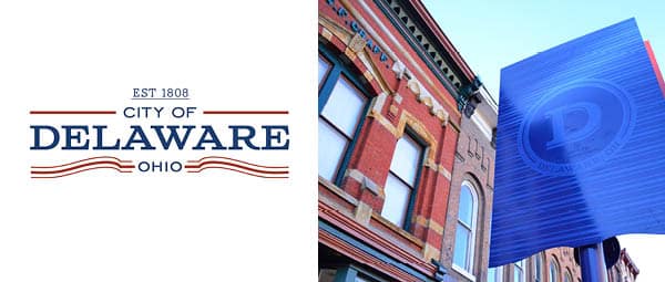
The City of Delaware Sign Program uses the palette’s unique shapes, patterns, and colors to present signage that represents the brand well.
2. Materials can elevate your brand palette. The type of materials you use for signage may also evoke the character and personality of your brand. Perhaps your community holds a preference for brick buildings or stone barrier fences, which would be excellent options for sign bases. Your brand palette may feature a cool pattern or texture that you can stamp into metal. The materials you select can provide exciting effects that elevate your brand image.
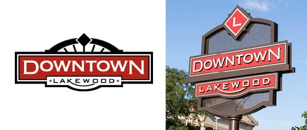
Downtown Lakewood Signs feature a die-cut metal to represent a graphic pattern found in the brand palette.
3. Design in 3-Dimensions. Signs are rarely viewed straight on. They have fronts, sides, and backs that all provide surfaces to play with. Unlike a logo viewed on screen, signs provide the opportunity to play with the dimensionality of your brand. Utilizing layering, shadows, lighting, and colors or images on different surfaces can turn a flat display into public art.
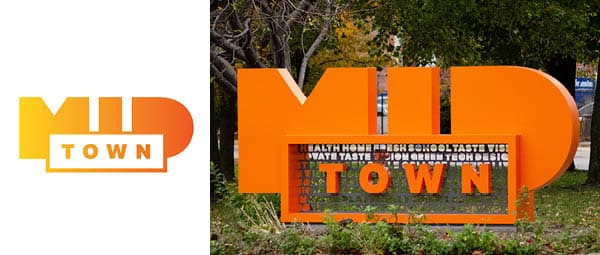
Midtown Neighborhood’s logo was brought to life as a 3-Dimensional art piece. The word patterns die-cut out of metal were a part of Midtown Neighborhoods’ expanded brand palette.
4. Context and size matter. The environment in which branded signage is viewed, its size and scale, and how well it is placed for proper viewing will make or break even the best sign design — which can reflect poorly on your brand. You don’t want to welcome people to your community by placing a beautiful sign next to a vacant lot or announcing a building entry by placing a tiny sign that will get lost on a large wall.
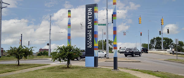
One of the Greater Old North Dayton neighborhood entry points is a busy intersection. A grouping of signs and complimentary visual elements created a more prominent welcome experience.
5. Experience is Brand. The most important thing to consider is that signage has a job to do. It presents information at the right place and time to help people feel informed, confident, and safe in their experiences. If it’s hard to read, holds confusing information, is placed incorrectly, and looks shabby, that is not how you want your brand translated.
Given their tremendous power, signs deserve more consideration throughout brand development. Like your website or marketing collateral, they’re an extension of your brand personality and require the same attention and effort. Even if you don’t have the reach and resources of a mega-brand like Mcdonald’s, you can still create great signs that people identify and follow.
Featured Post
Sorry, we couldn't find any posts. Please try a different search.