

The City of North Olmsted is a family-friendly suburb on Cleveland’s West Side, comprised of tree-lined residential neighborhoods inhabited by people of diverse backgrounds. However, the robust retail presence in the city, including a large regional mall and numerous car dealerships usually gets top billing. Unfortunately, that focus on retail leaves out many of the great amenities that are synonymous with the quality of life they offer residents. Attraction factors include affordability, new school facilities, great city services, bountiful recreation amenities, and ongoing infrastructure investments.
North Olmsted engaged Guide Studio in the design of a new visual identity as well as city entry and facility identification signs. Guide first re-evaluated the brand identity, finding a lack of communication around a healthy economy and other positive neighborhood and city services. Additionally, the city wanted to change its perception as an outdated retail hub where young families and renters come and go. As is Guide’s brand-building process, the studio interviewed residents, city officials, business owners and other stakeholders to establish a brand identity beyond big-box retail.
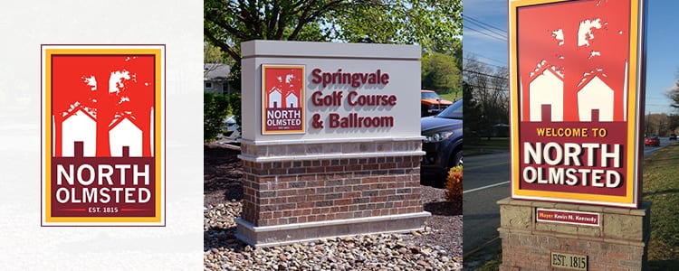
Guide created a visual brand that highlighted the suburb’s inviting lifestyle, one focused on proud families that love and appreciate their homes. The logo design features a traditional image of homes, playing with negative space to depict North Olmsted’s wooded residential streets. The logo’s layered frame, brick sign bases and establishment dates spoke to the suburb’s maturity and longevity.
With the brand identity creating the visual consistency that is necessary to establish a well-recognized brand, the City came back to Guide to help with messaging to tell their story. This included helping them better understand how to communicate with their specific audiences as well as a deeper dive into their City’s character and brand voice. “We did a visual arc for the city first, then went deeper around messaging and mood,” says Senior Design Consultant Jamie Wilhelm. “At the same time, we developed a secondary logo that separated text from the trees and houses. That created something less formal that North Olmsted could use on social media and other mediums. We wanted to give them different orientations so the type could be around or below the logo.”
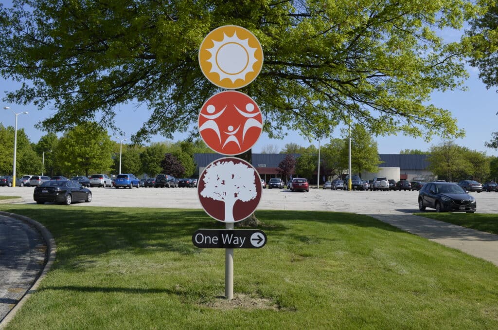
In recent years, Guide designed a placemaking program for North Olmsted that included bridge and exit ramp enhancements as well as signage placed on light columns in the median between traffic lanes. Guide also worked with the city on streamlining digital communications through a new email and newsletter design. A website refresh encompasses more recent programming, continuing a years-long relationship built on trust and good work. “North Olmsted has come to us for most of their signage needs,” says Jamie. “They needed a new sign for their senior center, so we connected them with a fabricator while coming up with the design.”
The city now has a consistent image and message across its entire communications spectrum, Jamie adds. Marketing materials have strong brand standards that strengthen a message of accessibility, affordability and quality of life. “The work is consistent and recognizable, with a cohesive look built around (the suburb’s) standards,” Jamie says.
Featured Post
Sorry, we couldn't find any posts. Please try a different search.