

Guide Studio has a special relationship with Shaker Square. Not only is our studio headquartered in the historic Cleveland shopping district, but we also had a hand in shaping how the plaza appears to the thousands of visitors it receives each month.
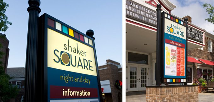
In 2004, upon acquiring the property, Cleveland real estate firm The Coral Company tasked Guide (then Studio Graphique) with developing a brand identity, signage and graphics program to enhance the overall shopping experience. At the time, Shaker Square was transitioning from a lifestyle center to a walkable neighborhood shopping district. Understanding that the square catered to people of all backgrounds, Guide had to create a functional sign program that supported a diverse audience, helping people navigate four quadrants of offices and retail, encircling an interior public space and a hard-to-navigate traffic circle. Cleveland’s RTA train intersects the property as well, which added to the project’s complexity.
“Looking at the history of Shaker Square, it’s a transportation hub with apartments, shopping, dining, and work spaces,” says Guide President Cathy Fromet. “(Any rebrand effort) had to be authentic to the community.”
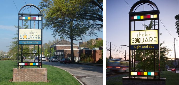
Utilizing the programming tagline “Night and Day,” Guide built out a contemporary identity that respects the site’s historic nature. Visitors are welcomed by gateway signs displaying a logo type that presented the “Q” in Square as the four-quad square. The identity features a lively color palette that was used to compliment the square’s Georgian-style architecture through colorful directional signage and canvas welcome banners along the main street. As visitors previously experienced difficulty navigating the property, the new signs provide detailed information on parking locations and nearby tenants. “We wanted the signs to fit the context and scale of the district. They feel modern, but also reflective of Shaker Square’s history and design.”
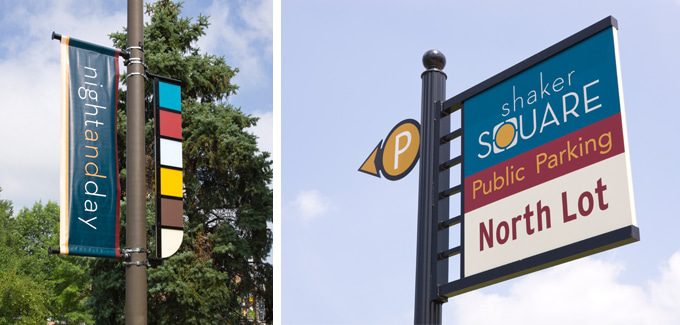
Taking cues from the architecture, gateway signs feature open arches and framework similar to the arched and framed doorways around the square. Meanwhile, signpost design replicates streetlights to fit within the context of an urban streetscape. Further work around the district included a simple map design and directory that greet pedestrians as they travel from storefront area parking lots, showcasing the variety of destinations across all four district quadrants.
The finished product matched the character and personality of the neighborhood, giving residents a feeling of ownership while enriching the environment. It also meets the needs of Shaker Square’s various stakeholder groups – among them the Ohio Landmarks Commission and the Shaker Square Area Development Corporation.
Featured Post
Sorry, we couldn't find any posts. Please try a different search.