

The University of West Georgia (UWG) operates by the slogan, “Go West.” Though this simple directive is a snappy way to attract new enrollees, not long ago the institution needed help in getting visitors and students around its 645-acre campus.
UWG serves a large commuter population, in addition to welcoming tens of thousands of visitors for university-related events and other activities. However, existing signage had become outdated, with directional and building identification lacking a visual hierarchy in how it presented information. A large directional sign might point to a grouping of school buildings, while building signage served as a cluttered directory that often listed several departments at once. Additionally, the glaring southern sun had faded signs to the point where they were even more difficult to read.
UWG brought on Guide Studio to develop signage that better represented the image and quality for which the university was known. Upon auditing the campus, Guide created a family of sign types that clearly identified buildings and other key locations. “We had to re-envision the entire exterior wayfinding sign family because the original signs were confusing,” says Guide Studio Design Consultant Kevin Fromet.
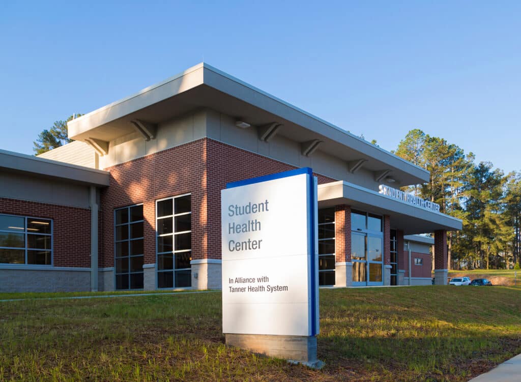
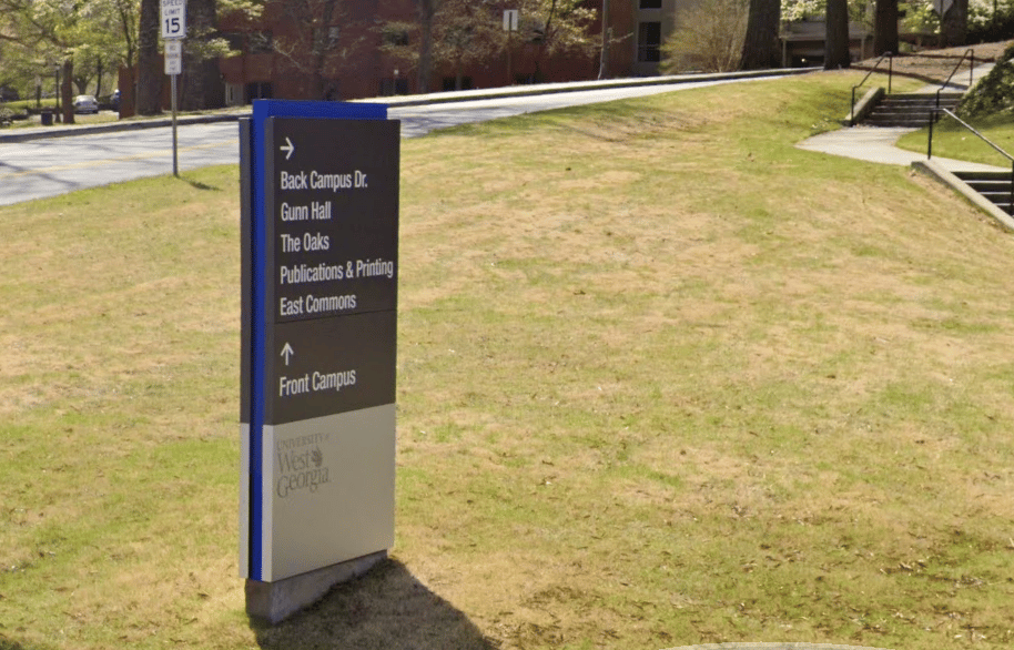
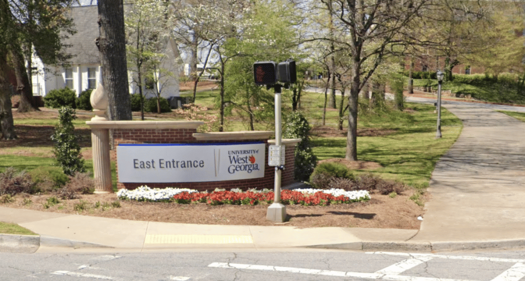
Simplicity, clarity and hierarchy of information was at the forefront of the program redesign. Guide created identification signs that featured building names and street addresses only. Gone were the directory-style signs that contained individual departments and secondary destinations – names that changed frequently and led previous signage to be overloaded with information. Establishing standardized nomenclature and messaging was also critical for presenting cohesive information.
The existing sign program used the same sign type for every situation – whether it was speaking to vehicles or pedestrians. “It is important that sign types be created for both the type of information being presented, as well as the context where it will be seen. We develop sign families that contain multiple sign types, but still look cohesive,” says Kevin. “A sign that is presenting directional information for a pedestrian needs to look different than a sign identifying a building. Users will begin to learn the different sign type forms in a system and what information to expect from each sign type.”
The new program utilized modern materials, university brand colors and fonts for sign types serving distinct functions and modes of transportation. This pedestrian-friendly campus now has a sign system that not only helps students and visitors navigating the campus on foot but also visitors seeking to find the University via car or public transit.
Beyond standard nomenclature and messaging, the system was designed to be modular, providing flexibility for future campus growth and changes to messaging.
“Colleges have a high degree of changeability, so we wanted to create a program that was update-friendly,” Kevin says. “As with a lot of campuses, UWG has a facilities department that can handle simple sign change-outs.”
Guide’s approach to signage and wayfinding for complex campuses includes documenting decisions to establish policy, standards and guidelines to maintain the continuity of the sign program as it is implemented, maintained and expanded. The team implementing and managing the program at the university don’t want to continuously recreate the wheel after this type of investment. This documentation not only contains the sign type drawings, it also identifies standard nomenclature, content policies, guidelines for the purpose of each sign type and how it should be used, as well as standards for colors and materials. “Through our work with Colleges and Universities, we have learned how important it is to have these design and content decisions documented to help maintain sign content and design. The people we work with to develop these sign programs may move on to other universities. They won’t be part of future decision-making processes, but if that information is documented, new staff can refer back to it.”
College enrollment is a competitive business that relies heavily on providing a positive campus experience. If a prospective student’s first impression is one of frustration because they are lost, or that the outdated, faded signs are a reflection of the quality the college is going to provide, it sets the tone for the rest of the visit. UWG’s new sign program provides a modern touch to the campus, a seamless experience for visitors, and a manageable system for the University for years to come.
Featured Post
Sorry, we couldn't find any posts. Please try a different search.