“You never get a second chance to make a good first impression.”
Sounds harsh, but it’s true now more than ever. From job interviews and first dates to your Facebook profile, people judge you quickly and can be critical.
The same can be said for your website. In fact, research shows that it takes about 50 milliseconds (0.05 seconds) for your visitors to form an opinion about your site, which generally determines whether they’ll stay or say goodbye. So, what impacts their decision? It’s simple: Good website design.
Time to tidy up your community website
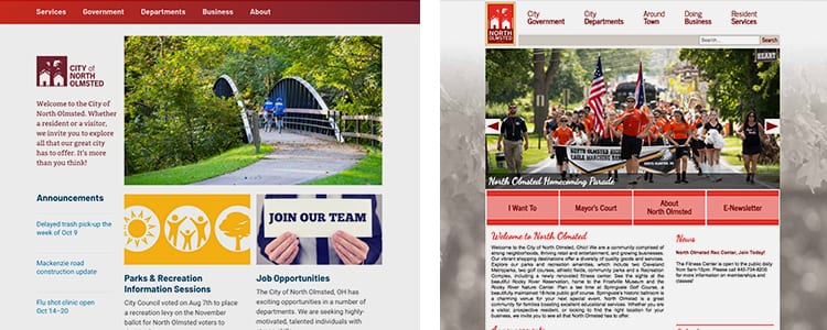
Unfortunately, good websites aren’t so easy to come by, especially among civic organizations. Unlike their parks, town centers or beautiful neighborhoods, many community websites are outdated, cluttered with information and not responsive for mobile devices. How would your constituents react if they came across 404 error signs posted throughout the city?

A poor website experience isn’t acceptable anymore, especially in our digitally-driven society. While a bad in-person experience is just as damaging, people expect your website to be the digital welcome mat for your community. In fact, they will visit your website before ever stepping foot in your community, so you need to reflect what you want people to see and know about your community.
Tips for Improving Your Website
So, where do you start? Depending on your needs, goals and infrastructure, website projects can be a real beast. While you don’t have to tackle the whole thing at once, you need to make the most of your prime real estate. With only a finite amount of time to delight (or disgust) your visitors, here are a few areas that will give you biggest bang for your buck:
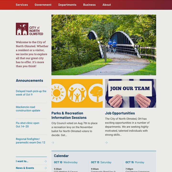
1. Provide a warm welcome. As primary starting point, your homepage should be your virtual concierge desk. In addition to shedding light on who you are, what you do and why you’re important, your messages should be warm and inviting. Furthermore, your visuals should inspire people, making them think, “I want to be there.”
Our tip: Cut down on text and incorporate a one-two minute video or photos that accurately reflect your community experience. Instead of visuals of your staff or a letter from the mayor (there are other places on your website for these items), showcase actual residents and visitors enjoying your amenities.
2. Infuse it with personality. Your entire site needs to reflect your brand strategy and personality. Incorporate your distinguishing elements – your fonts, colors, images and messaging – to let your diverse audiences, including residents, businesses, government officials and more, know what makes you different than all of the communities that surround you.
3. Enhance navigation and headlines. Like your wayfinding program directs people from Point A to Point B, your website needs to help people navigate to other important information such as events, your blog, a staff directory, etc.
If your site is built on a good content management system like WordPress or SquareSpace, it’s easy for a web designer to refresh your navigation and headlines. All too often, we see community websites that overload their homepages with information. Ultimately, this leads to people bouncing within seconds of their arrival. Instead, add a little mystery and intrigue through colorful, compelling calls-to-action that direct visitors to other important areas of your site. And, don’t be afraid of a little white space!
4. Create a content calendar. If you’ve made all of these updates, you’re probably ready to sit back and relax, right? Think again. Like your front yard, your website needs constant upkeep. While you don’t need to update it every single day, you need to create a content calendar that maps out key events, announcements, articles and other information that are relevant to your audience. Not only will creating this calendar help you prioritize and organize information, but it makes implementation more turnkey.
5. Delegate responsibilities. You can’t have only one set of keys to the backend of your website. It needs ongoing attention from a variety of people who are responsible for important aspects of your community. With proper training and regular communication, you can delegate content ownership to them as long as they feel comfortable making regular updates. While you might want to reserve the homepage for yourself or a designer given its prominence, making your website a team-oriented initiative can help ensure its long-term success.
Are you considering a website redesign? Guide Studio is happy to answer your questions or provide a quote. Contact us today!
Sign Up Fore More Insights
Get the newest information right in your inbox via our monthly newsletter, designed to inspire and inform community visionaries, public space advocates, and facility planners.