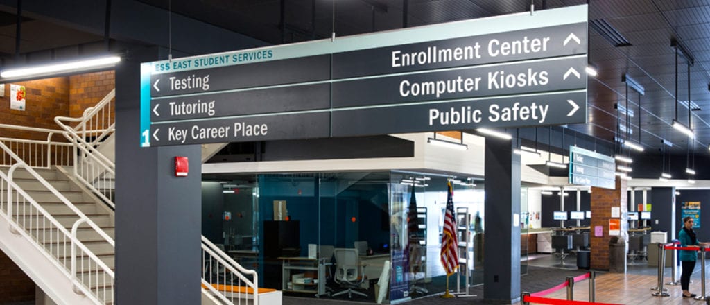
Cuyahoga Community College or “Tri-C” offers a multitude of credit-based courses and career technical programs across its regional footprint, serving students at four campuses and numerous off-campus sites strategically located throughout the county. These campuses are populated not only by students and staff, but residents coming to campus for events and workshops as well. Visitors to the college expect to find their way around without issue, meaning every interactive touchpoint they encounter must be clear and concise. “It’s important to consider how a first-time user understands their surroundings and moves around them comfortably,” says Guide Studio President Cathy Fromet. “If they’re not comfortable, they may not come back, so they should be given a great experience from the beginning.”
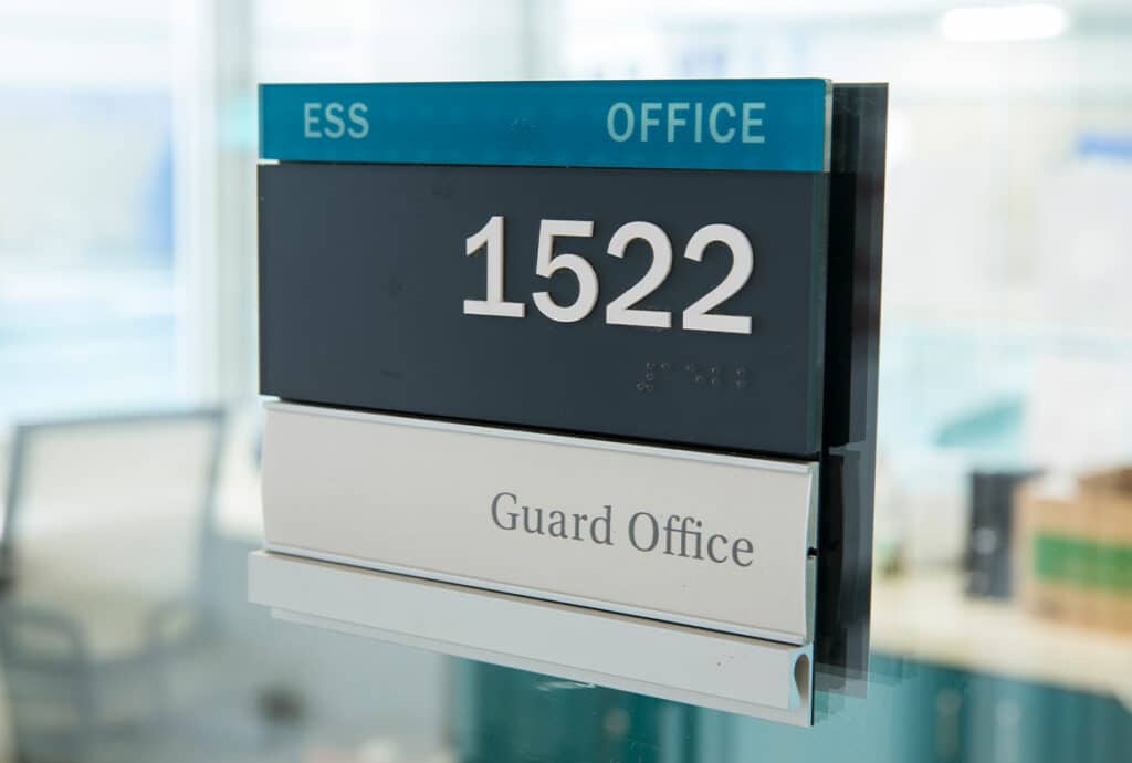
In the late 2000s, Tri-C renamed the buildings on its three main campuses which meant that messaging on the current signs were no longer accurate. Guide also analyzed traffic flow on site and learned how different audiences – students, visitors and staff – accessed those spaces. Through this work, Guide identified a standardized signage system to help navigate visitors from parking lots to main entries and then through a maze of doors, walkways, and tunnels connecting various facilities. Additionally, our team found inconsistent and non-sequential room numbering throughout buildings on several of the campuses, resulting in confusion for students and staff.
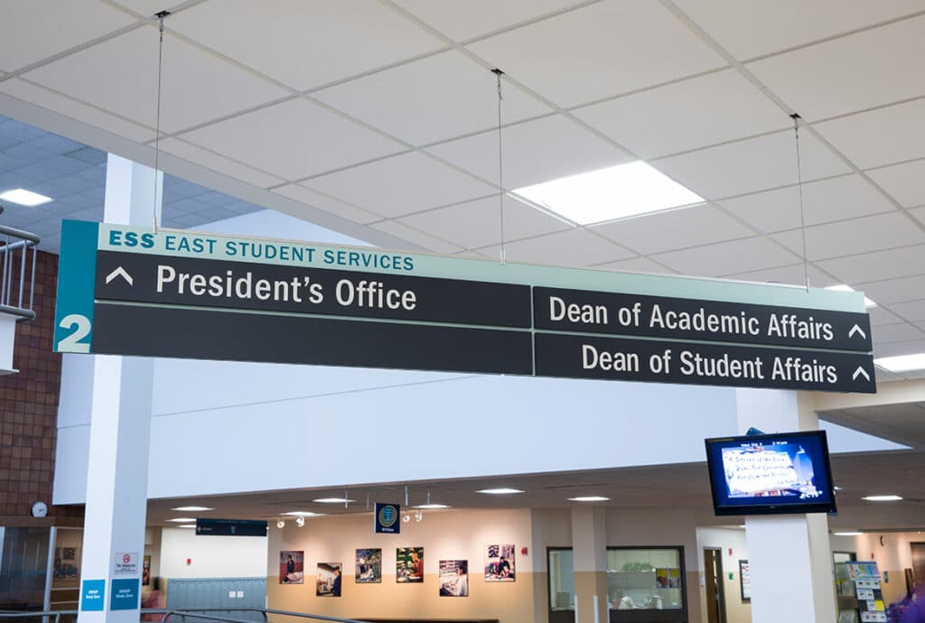
“We forget how much people rely on inherent understanding when navigating a new space. Sequential room numbering is an important factor in how people understand their surroundings. This effort allowed us to create a master plan for the future, creating new rules and philosophies for wayfinding as well as the design and development of a standard sign system that could be used on all campuses,” says Cathy. “The system was set up so that Tri-C staff and consultants didn’t have to come back to us for future design and implementation. As they created new buildings, they had a standard and a guide, which saved them time, money, and effort.”
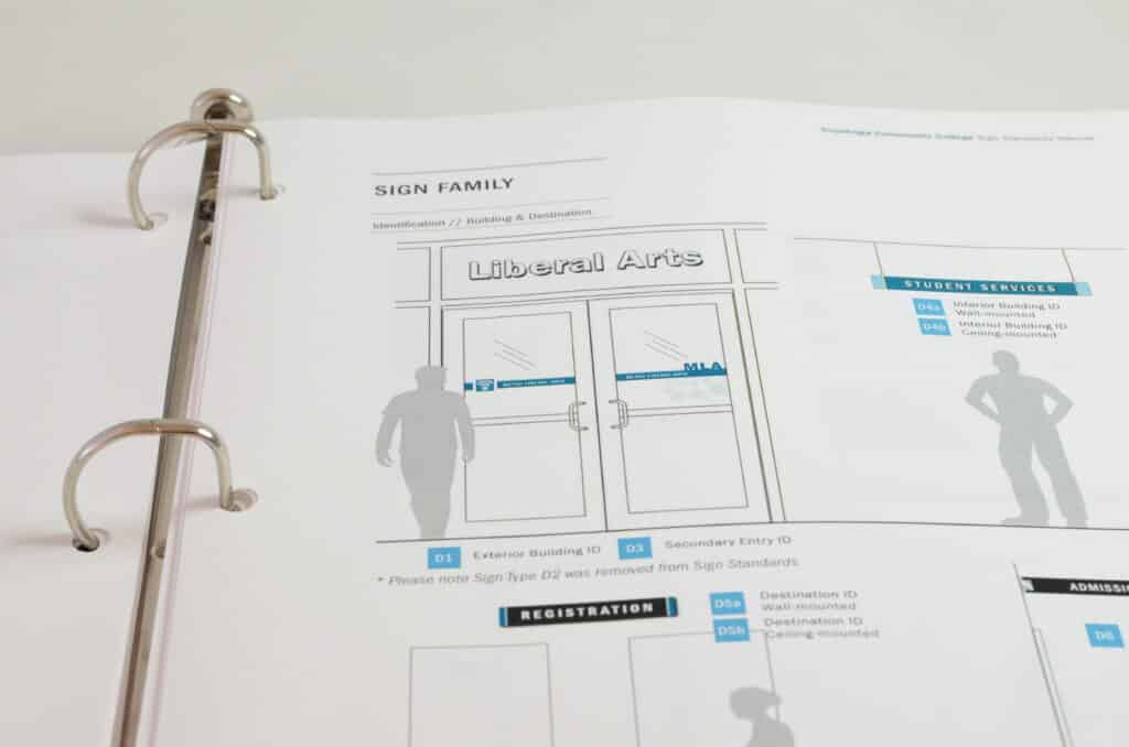
Guide created a color-coded sign program to provide users key visual cues in combination with building numbers, naming, and consistent naming convention use. Together, these elements simplify the experience for visitors traveling between connected campus buildings. People don’t even have to be outside to know where they are going. The team also recommended a modular sign construction to allow staff to easily update sign components or messages. “Spaces move and change all the time on college campuses,” Cathy says. “Instead of buying a whole new sign, Tri-C can swap out a piece of it. It’s a flexible system.”
The project set the groundwork for future partnerships with Tri-C while acting as a springboard into large-scale interior and exterior signage programs for a variety of organizations.
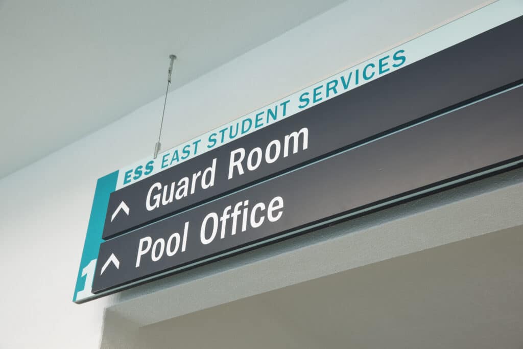
“It opened our eyes to understanding how to pair navigation and experience analysis, strategy and planning together with design for the most effective wayfinding,” says Cathy. “We had to evaluate the visitor experience completely and make clear how signs functioned in a complex place. Tri-C was our first complex campus wayfinding project.”
Sign Up Fore More Insights
Get the newest information right in your inbox via our monthly newsletter, designed to inspire and inform community visionaries, public space advocates, and facility planners.