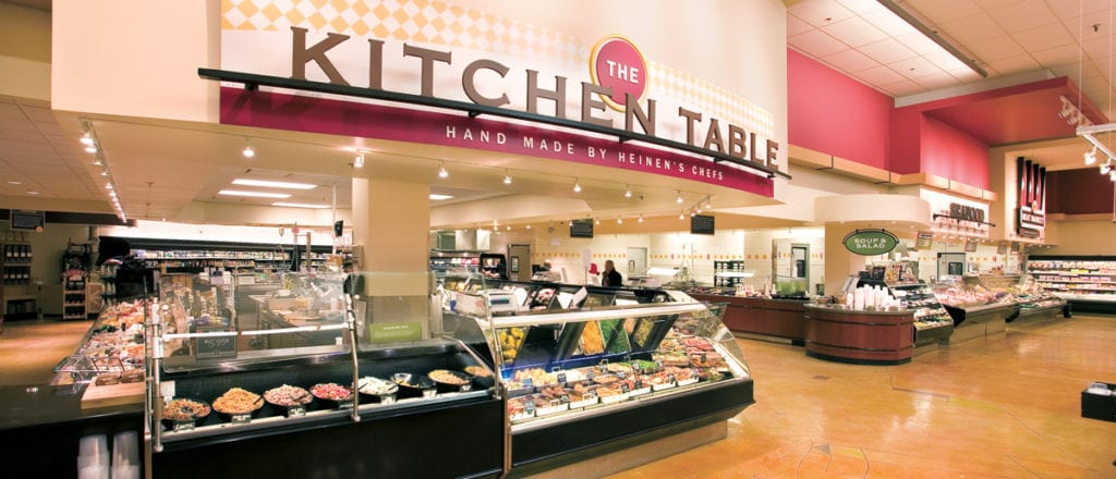
Heinen’s Fine Foods is a family-owned regional supermarket chain with locations in Northeast Ohio and the Chicago metro area. In 2005, Guide Studio helped Heinen’s articulate the shopper experience through a new signage and environmental graphics program. As a third-generation premier grocer, the Heinen’s store brand centers on quality, value and service. Missing at the time was a unified signage style that appropriately connected brand image with store architecture. “All the stores had different sign programs, and none captured the essence of Heinen’s story,” says Guide Creative Director Gina Gerken. “Customers couldn’t articulate why it was special for them to shop there.”
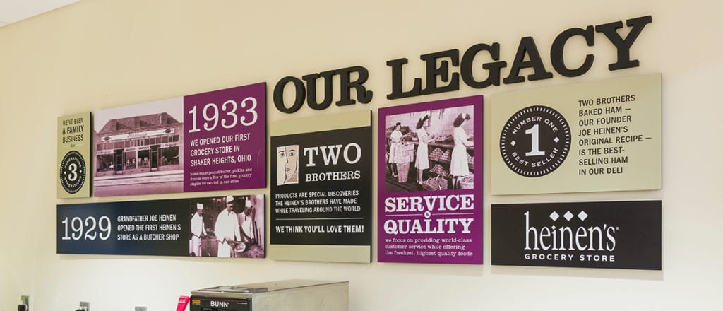
Guide partnered with Process Creative Studios to integrate signage with a larger design vision. Starting with three area stores, we developed a brand palette to bring consistency to the shopping environment. This step included a warmer color scheme as well as consistent signage that maintained its function while strengthening the company’s identity. Sign graphics for specific departments were designed similar to specialty shops at an outdoor market. Guide selected a variety of fonts for use within the system, conveying brand personality traits and allowing room for flexibility.

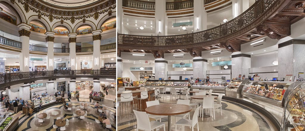
We also transferred key aspects of the signage program to a new downtown location in the historic Cleveland Trust Building. Transparent materials used for store signs matched the unique design elements of a large on-site rotunda and other surrounding architecture. “We simplified the program, making it cleaner and more appropriate for the location,” says Gina. “We had to consider the uniqueness of the rotunda, and how signs would work to direct people in a location they’re not accustomed to shopping in.” Over time, Guide was asked to modify the sign system to support new stores in the Cleveland area, including Chagrin Falls as well as Heinen’s new locations in the Chicago market.
A robust working relationship with Heinen’s continues today. Guide maintains store signage alongside newer programs that pull digital media into the physical environment.
For example, Guide recently rebranded Club Fx, a free nutrition program that offers patrons incentives and personalized health tips. In perfecting the campaign, Guide designed a logo, brand palette and launch materials comprising an assortment of print collateral, product labels, and email graphics and templates. In addition, we updated every Heinen’s wellness department to bring attention to the grocery chain’s healthcare focus.

“The biggest challenged was getting people to understand what the program meant,” Gina says. “Fx is food as a prescription knowing that their audience was unaccustomed to seeing this service in a grocery store.” As with all of Guide’s clients, the goal is to help Heinen’s strengthen customer connections. “One of our core values is to be ego free,” says Gina. “The collaboration with Heinen’s is really great. They clearly care about what they do, and so do we. We appreciate each other because of that, and align with them very well.”
Sign Up Fore More Insights
Get the newest information right in your inbox via our monthly newsletter, designed to inspire and inform community visionaries, public space advocates, and facility planners.