Since its inception in 1997, Guide Studio has partnered with communities and place-based organizations to help with issues related to image, reputation, and experience — which is addressed through branding and wayfinding services. Many times, organizations will cite a problem by saying “We need wayfinding.” Once deeper questions are asked around the issues they are trying to solve, the answer of simply developing a signage and wayfinding program may not be so clear.
Such was the case with the City of Delaware, located 30 miles north of Columbus. Delaware enjoys a 95% occupancy rate in its downtown commercial space, with a light industrial manufacturing base and proximity to Ohio Wesleyan University further boosting the local economy. Though the City originally sought a consultant to help develop a signage and wayfinding program for the City and Downtown, they ultimately selected Guide when early discussions revealed that shoring up the City’s brand would be more effective in showcasing all the city had to offer — helping Delaware maintain its population while attracting new businesses and visitors. “The city has a lot of strong assets, and they ultimately wanted to build awareness around them,” says Guide President Cathy Fromet. “We knew signage would help people find these things once they were in the city, but it wouldn’t help them investigate what was offered and make the choice to visit.”

As with all cities, Delaware has a “brand”, but it lacked the right tools to tell the complete story. Working with local stakeholders made up of residents, businesses, and institutional partners, the Guide team helped the city better articulate the things people loved the most about this community. The brand strategy solidifies the city’s positioning and narrative — allowing them to better communicate the values, character, and amenities that would attract people to their community.
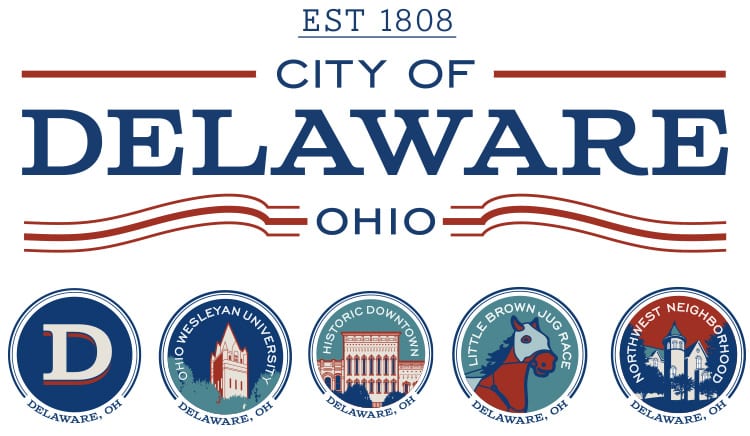
Authentic brands should evoke a place’s personality and character, Guide honed in on Delaware’s well-established history showcased in their well-preserved downtown architecture, close-knit community, and high-quality amenities — dubbing character theme “Modern Americana.” This theme is carried through every element that represents their brand story and identity. “Tradition Badges” were also created to support brand messaging and showcase featured amenities – among them the historic downtown and surrounding neighborhood, Ohio Wesleyan, as well as the Little Brown Jug horse race that Delaware hosts every year.

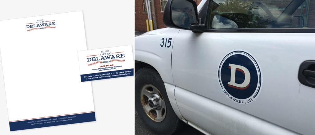
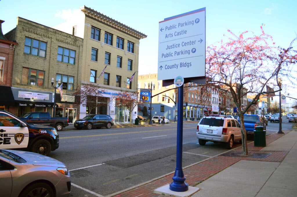
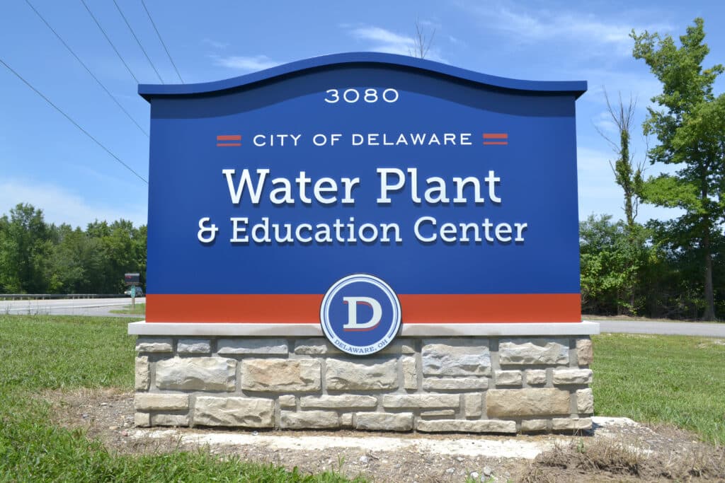
Upon finalizing the new visual identity, Guide worked with the City on how and where to use its new brand assets. Badges are now utilized by the city for various marketing materials, while a foundational logotype developed by Guide is employed across traditional city communications. With the brand elements ready, Guide was then able to develop a citywide signage and wayfinding program that presents a cohesive and consistent image that represents the quality and character of the community.
For Guide, the project served as a springboard for helping communities understand the power of brand and how it should be used. “Having a strong brand gives cities the confidence in telling their stories the right way,” says Cathy. “Rather than just a pretty logo on a page, this work helps highlight what people love and cherish most about their communities. It also articulates what those benefits are so they can tell more people. Once people arrive, then a clear and well-designed signage and wayfinding program can become an ambassador for the brand.”

Sign Up Fore More Insights
Get the newest information right in your inbox via our monthly newsletter, designed to inspire and inform community visionaries, public space advocates, and facility planners.