Guide Studio’s current client portfolio represents a mix of local and out-of-state communities and organizations. However, that growth required leaving a happy place of well-known cities and neighborhoods for uncharted territories and new adventures.
The City of Holland, Michigan, provided this opportunity, hiring Guide Studio with the creation of a city-wide signage and wayfinding program. From research conducted while developing the proposal, the team was immediately intrigued by the picturesque city on the shores of Lake Michigan and Lake Macatawa. Holland is home to Hope University and is known as a getaway destination where small-town charm and big-city amenities live in comfortable harmony. As a northern, lakeside city, their winters are similar to Cleveland’s, but that doesn’t stop people from visiting and engaging. Heated sidewalks front over 100 specialty shops, breweries, and restaurants sparkling with European charm. Holland was a haven for Dutch immigrants in the 19th century, an atmosphere that informs the modern city’s mix of history and hospitality.

Guide had little familiarity with Holland upon receiving the proposal, even as the firm had already completed complex wayfinding programs for entities in-state. “We knew we had it in us to go after work out of state, but it is challenging to demonstrate that if your portfolio doesn’t show other out-of-state projects” says Guide President Cathy Fromet. “We learned that the project manager in Holland was a big fan of Cleveland — so luck was on our side — while also recognizing our quality of work.”
The Guide team happily traveled to the friendly oasis during the late spring of 2014 — a perfect time to visit the city. Multiple days were spent on site facilitating discovery sessions with local stakeholders that represented the residents, businesses, and institutions that call Holland home.
During the visit, Guide also conducted a wayfinding and experience audit to fully understand the issues that a new sign program could address.

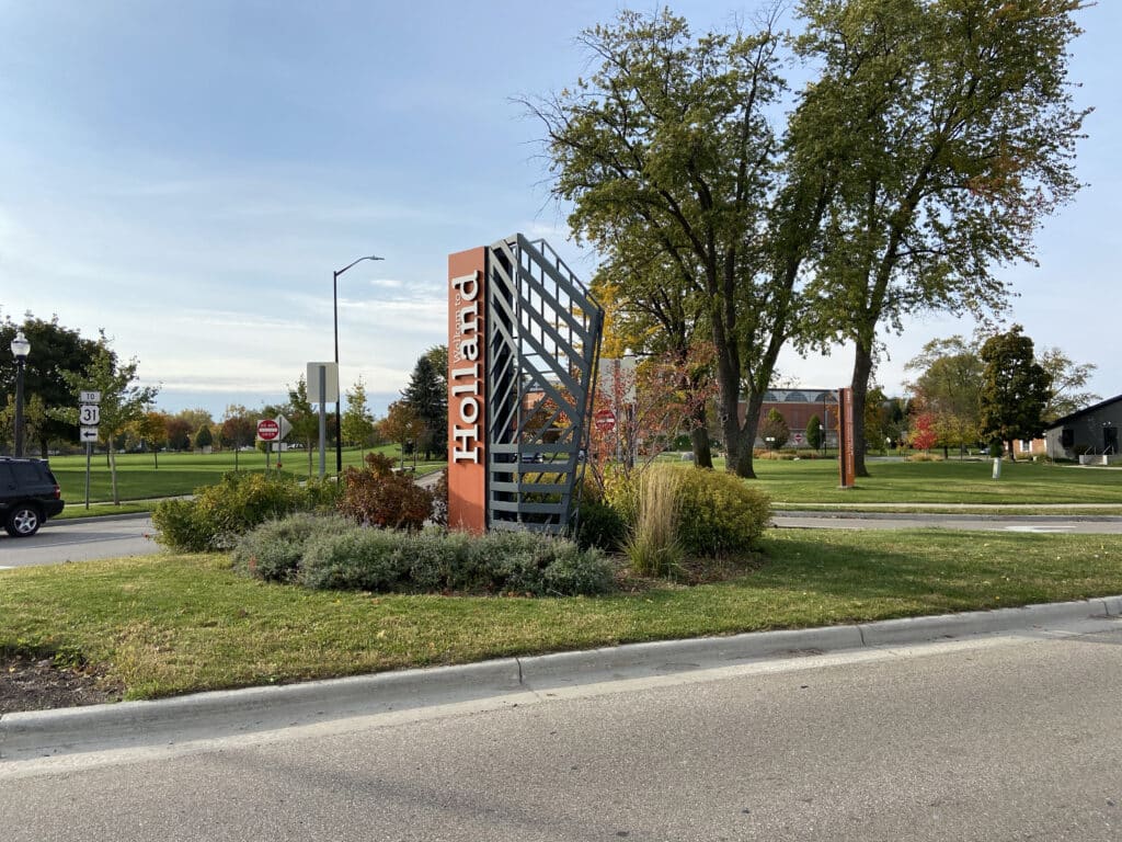
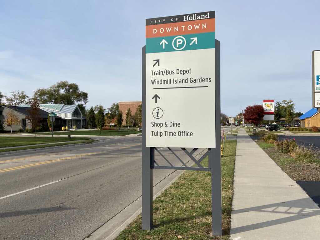
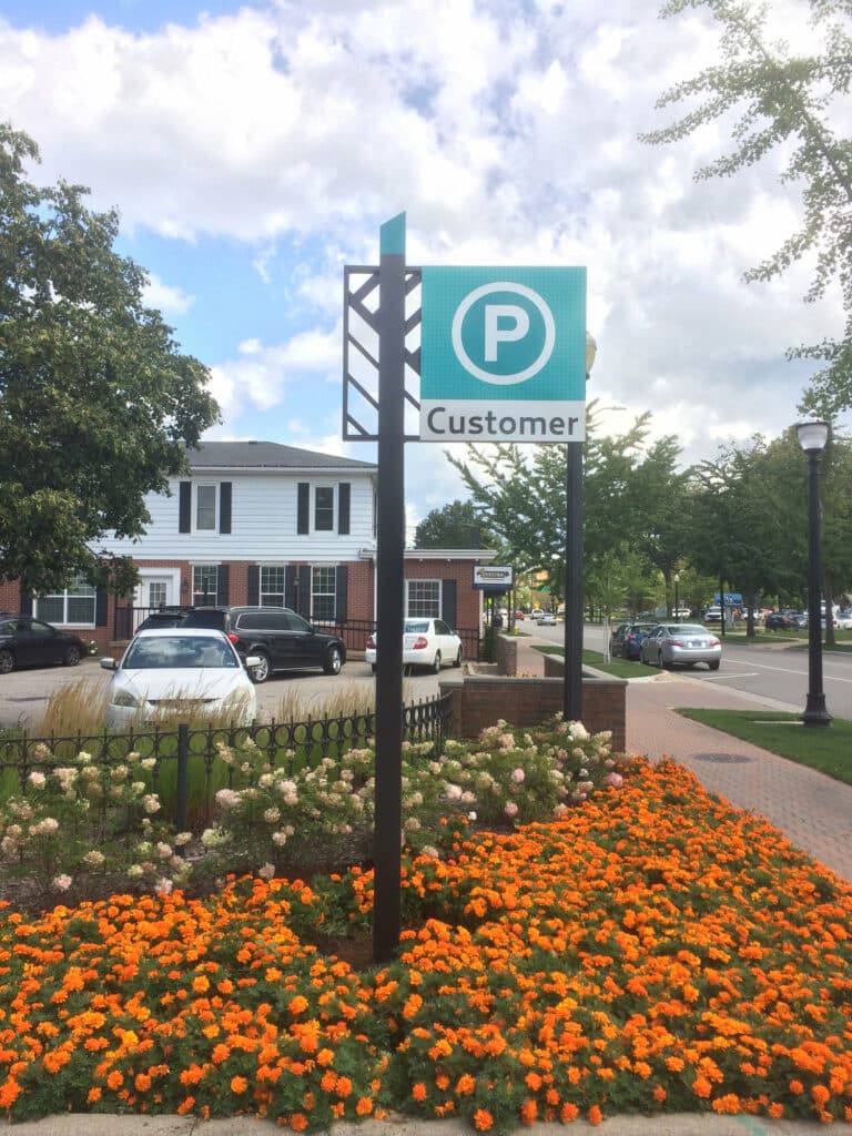
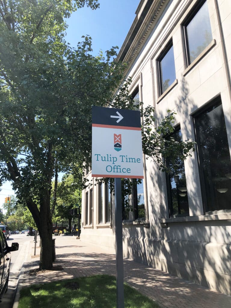
The sign program design took elements of the new brand identity – including a traditional Dutch windmill – for city gateways and directionals to parking and critical destinations. Deliverables included design drawings, location plans and message schedule, draft budget and implementation plan, to help Holland’s leaders to plan out program fabrication and installation over time.
“This project was a chance to bring their brand to life, and it certainly did that,” Cathy says. “When a city invests that much in brand identity, that is something that needs to be used. One of the best ways to build brand awareness is to see that visual representation adopted into the signage.”

The project also redoubled as a test site for our approach to the discovery process and visit — which is still used today. Additionally, the success of the effort served as a launch pad for future projects outside of state borders. “Cities are careful when making this type of investment, so this project built our credibility around (out-of-state) work,” says Cathy. “It lent to our portfolio and gave us the confidence to communicate a process that allows us to work with clients who are not local because you have to build different efficiencies when not working locally and allow us to create great brand and wayfinding programs for places we were not familiar with.”
Sign Up Fore More Insights
Get the newest information right in your inbox via our monthly newsletter, designed to inspire and inform community visionaries, public space advocates, and facility planners.