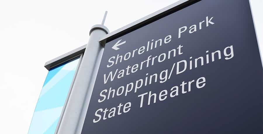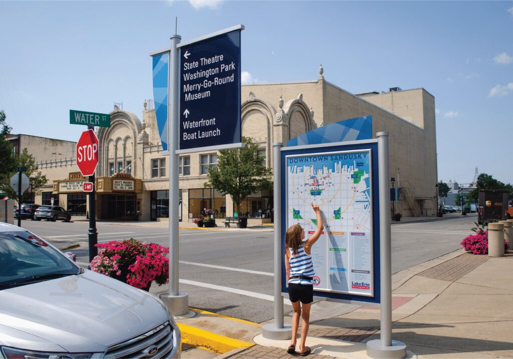
Like individual bricks paving your journey’s path, signs are one of many essential elements that shape a well-designed wayfinding program. They guide where to begin or end the experience and influence what you see and feel along the way.
Everyone can relate to the unsettling feeling of being lost, and often, once we actually get there (wherever that may be), we end up being so frustrated that the entire experience is ruined. No one enjoys being lost, and unfortunately, even the most sophisticated navigational tools like Google Maps sometimes fall short.
You shouldn’t have to cling to your devices to reach your final destination. Successful places invest time and effort into helping visitors find their way the first time, and every time they return. The consequences of not doing so – frustrated visitors, complaints, and reduced business and economic investment – should be reason enough to craft a strategy that supports a seamless visit experience.
“When it works well, wayfinding tells us where we are and helps us get to where we want to go, without us even noticing.”
Wayfinding Defined
Simply put, wayfinding means helping people in motion navigate a new place, whether they are traveling by car, bike, or foot. It is a comprehensive system of information that guides visitors through a physical environment and establishes a sense of place in their minds. When it works well, wayfinding tells us where we are and helps us get to where we want to go without us even noticing.
Signage is not Wayfinding
Many people confuse wayfinding with signage—the kind you see on city streets, in airports and parking garages, and across hospital corridors. While signs are among the most recognizable tools, wayfinding is a bit more complex. Wayfinding connects various verbal and visual elements, including space, maps, directions, architecture, landscape design, symbols, colors, and logos, to enhance your brand and the overall experience of your place.
Signs are often used as a cure-all solution, but adding more signs or redesigning old signs will not solve a wayfinding problem. In fact, in most cases, it’s more detrimental than helpful. Once and for all, we’re going to debunk some of the biggest misconceptions about the relationship between signage and place-based experiences.
MYTH #1: Signs Increase Visit Success
Don’t get us wrong, signs are extremely important tools; however, many organizations believe that signs are the hardware for making a poor experience better. While a consultant can help you determine if a new sign program is what you need, your problem(s) may have more to do with the experience you are offering to visitors. You don’t want to implement new signs that direct people to a disappointing experience. That’s the exact opposite of what wayfinding should do for you.
MYTH #2: The More Signs, the Better
In the case of wayfinding, you need to take a less-is-more approach. An abundance of signs can add confusion, rather than clarity, to your experience. Good wayfinding employs as few signs as possible. Additionally, your signage should not live on every path to your destination. Sometimes, the quickest route to your location may take people through an undesirable area. Consider the journey you want visitors to take and implement signs to serve as their compass.
MYTH #3: Signs Support Your Regulars
Signage isn’t meant for those already familiar with your place; it should be designed for first-timers and infrequent visitors. Good wayfinding helps people develop mental maps of the terrain, eventually enabling them to get from one place to another without relying on signs.
MYTH #4: Signs Drive Business
Signs are important for individual businesses. However, wayfinding is not meant to market individual businesses. Wayfinding should guide the experience of your place while making it easier and more comfortable to discover the businesses in your community.
Also, if people aren’t aware of your place to begin with, they won’t come. Wayfinding and signs are used while people are actually in your place, but they are not the solution for increasing visits.

Addressing the Audience Journey
From before they arrive to when they depart – and all of the stops and decisions they make in between – visitors rely on different types of information and support throughout each stage of their journey. As you begin to fill in the lines of your wayfinding plan, consider what tools you can employ to ensure your visitors have a seamless experience.
- Approach: While it’s hard to control what’s happening on the outside rings of your place, you may need to coordinate with other agencies, such as Department of Transportation and surrounding communities, to make sure that your destination is represented on their wayfinding signage and that all mentions of your place align with your established naming conventions.
- Arrival: In the process of arriving at your destination there are two types of entry points: jurisdictional boundaries and the point where visitors feel that they have truly arrived. This perceived, or emotional, entry point is your greatest opportunity to make an impact. Bold gateway signage that welcomes your visitors, complements the environment, sets the tone for the rest of their interaction with your place.
- Decision Points: You need to ensure that directional signage is placed before or at key decision points to clarify the best ways to navigate different areas of interest. As someone approaches a corner and has two choices to make – left or right – having a sign that is visible as visitors approach assures them that they are heading the right way and helps them avoid getting lost. These signs can also serve as an opportunity to suggest and encourage traffic to certain destinations within your place.
- Departure: To ensure a smooth journey away from your destination, visitors should have access to pathways and signage to orient and direct them home. Wayfinding is about improving all aspects of experience, from start to finish, by arming visitors with the information they need to find what they are looking for. Most importantly, it gives them the confidence to come back without having to rely on anything but their memory from past visits.
“Most importantly, good wayfinding gives them the confidence to come back without relying on anything but their memory from past visits.”
Other Considerations
In addition to your audience’s journey, a comprehensive wayfinding strategy addresses various physical, environmental, and social factors that can influence the experience of your place. Consider how these different components will impact your strategy.
- Order: Where do people begin their journey, where does it end, and what will they encounter along the way? Wayfinding helps people navigate through these different stages easily, and forgetting to address one section can sacrifice a visit a success.
- Hazards & Opportunities: Which areas do we want people to avoid? Conversely, where do we want them to go? Use signage, bright lighting, and/or physical landmarks to pull people into certain locations. You can also use signage, gates or even walls to keep them out.
- Transportation: You may need different types of signage that distinguish the best paths to take depending on your visitors’ modes of transportation. You can create sign families – vehicular, bike and pedestrian – that differ in color and function, yet similarly guide visitors where they need to go.
- Visibility: As you develop gateways, signage and landmarks within your place, make sure nothing gets in the way of the clarity and prominence of them. People of all heights and vision levels should be able to view important communication and symbols from up close or far away.
- Lighting: Can people see your signage in the dark? If people are going to be navigating through your place during the evening hours, you want to make sure that signs are close to lamplights that illuminate them in the dark.
- Consistency: Your signs may be visible, but is your nomenclature consistent and memorable? Consistency helps people create those mental maps, allowing them to recognize where they are and where they need to go.
- Navigation Tools: As you’re building your wayfinding program, you need to ensure that both print (maps, travel guides, brochures, etc.) and digital navigation tools (Google Maps, website, etc.) support the path you are encouraging visitors to take.
- People: Even better than signs, people can serve as one of the most effective wayfinding tactics. While the feasibility of using human wayfinders depends on budget and the size of your space, people can be a trusted resource for directions, especially within large places like college campuses, airports, museums, and stadiums. If you’re considering this approach, make sure everyone is on the same page in terms of the paths, nomenclature, and landmarks.
Maximizing Place Potential
It is easy to think about how one sign here and one over there will solve directional challenges within your place, but simply adding new signs can cause even more confusion and misalignment. While wayfinding may sound too complex or fancy for your needs, there is no purpose in promoting a great place if you aren’t willing to invest in the support system needed to help people enjoy it. Wayfinding encourages you to look at your entire place to ensure visitors can get to where they want to go, while spending their time (and money) experiencing everything you have to offer.
Sign Up Fore More Insights
Get the newest information right in your inbox via our monthly newsletter, designed to inspire and inform community visionaries, public space advocates, and facility planners.