Top considerations for transferring your brand into a physical place
On any given day, you likely travel across a variety of “branded” environments. When you’re grabbing your morning coffee at Starbucks. Walking into your office space. Eating lunch at your favorite café. Or when you’re overspending at Target. It’s any place where you and other people go and gather.
Whether you realize it or not, many of these places have taken a strategic approach to what you see, what you hear and how you feel from start to finish. In fact, they’ve likely hired a design team or consultant to help them create a connective brand experience. Especially one that leaves visitors hungry for more.
It’s not just for corporate brands
Aside from the obvious Fortune 500 brands that spend millions (per year) on building strong branded environments, many civic organizations and communities – small and large – are following suit. They realize the value of applying best practice branding and design to their physical environments. Not only does it foster the engagement and loyalty everyone desires, but it ignites brand unity that shines from the inside out.
Having supported a number of our clients with this endeavor, we’re familiar with the nuances of translating a brand into the physical environment. Here are the top considerations as you connect your brand to your physical place.
1. Start with your purpose.
Too often, organizations jump straight into design – wanting to see logos, taglines, messaging and colors splashed across every corner. That is a mistake. For a physical environment to yield maximum benefit, it must be framed as a high-level strategy supporting your mission and goals.
The City of Delaware is a quintessential example. Following a brand identity makeover that resulted in a renewed purpose and personality, our team aligned design assets with the community’s authentic character. They wanted to blend their historical charm with a modern, growth-oriented mindset. Every single decision – from wayfinding signs to marketing collateral – was grounded in this community perspective.
2. Think storytelling before signage.
When people think of place-based brands, it’s easy to jump straight to signage. After all, how can you effectively navigate a physical environment without it? However, we always start with the story – the essence of what we want to communicate and how we communicate it. Do you want people to learn about your history and milestones? Understand your people and culture? Discover major successes?
Take some time to define and document the mission of your narrative so it’s crystal clear to everyone involved in the development of your physical environment. Ultimately, your story goals influence how each chapter – the various layers or levels of your place – unfolds through important design decisions.
3. Emphasize function over form.
If nailing down your story is the first piece of the puzzle, your signage and communications start to fill in more of the gaps.
From the beginning of every client engagement, our priority is to ensure brand and wayfinding signage is usable at different scales. It’s essential to consider all of your users – their needs and goals – as you plot your sign program.
We also recommend taking a quality versus quantity approach. You don’t need to plaster your logo all over the place or stick a sign into the ground every five feet to take your branded environment to the next level. Ensure every element of your program has a distinct purpose. If it’s not an essential part of your story, ditch it.
4. Try something different.
Being consistent with your brand design is important, meaning you need to apply strict brand standards. Everything should have a cohesive look and feel. However, that doesn’t mean you can’t spice things up from time to time – adding some diversity to the mix. Make people want to stop and soak in an aspect of your story.
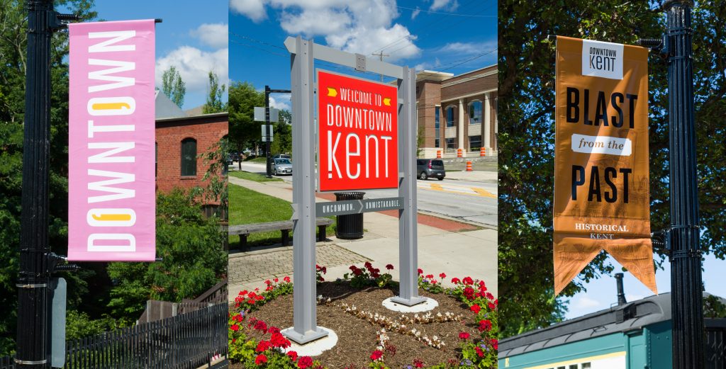
You can accomplish this by capitalizing on the various colors, typefaces, symbols, patterns and messages in your palette. Together, they can convey your brand personality in creative, unexpected ways. For example, the City of Kent created a “Kent Speaks” program – an umbrella that tells the city’s story and honors the college town’s youth and vibrance. Resulting wayfinding banners incorporated bold colors and fun phrases – sayings like “High Five a Stranger,” “Shop ‘Til You Drop,” and “Eat Yummy in Your Tummy Dining,” – to guide people through a downtown atmosphere full of opportunities.
5. Be yourself.
While a quirky and fun sign program might work for City of Kent, that doesn’t always mean it will work for you. You have to be authentic to your brand character. People can always spot a fake.
If you have taken a thoughtful, strategic approach to your brand identity, you shouldn’t have to emulate what everyone else is doing. Consider what elements of your place make you special and unique, and maximize them through powerful storytelling. Done right, you’ll create a physical environment that’s unmistakably you.
Interested in telling your community’s story? We can help! Get in touch with us.
Sign Up Fore More Insights
Get the newest information right in your inbox via our monthly newsletter, designed to inspire and inform community visionaries, public space advocates, and facility planners.
